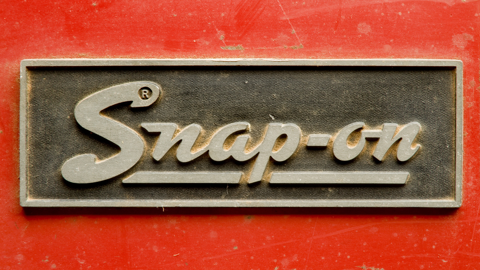
The evolution of Snap-on’s logo reflects the toolmaker’s growth and enduring reputation in the automotive industry. Established in 1920, Snap-on has become synonymous with quality and reliability, carving out its niche among mechanics and DIY enthusiasts alike. The brand’s commitment to producing tools that deliver exceptional performance has persisted through its century-long history.
From Simple Beginnings to Iconic Identity
Snap-on’s journey began with a straightforward concept: five hand tools capable of performing the tasks of fifty through interchangeable socket attachments. This innovation laid the groundwork for the company’s success and ultimately shaped its visual identity. The original logo, a simple underlined script in red, lasted from the company’s inception until 1944. This logo remains one of the longest-serving designs in the brand’s history.
As Snap-on expanded, particularly during the war years, the need for a modernized logo became apparent. In 1944, the company introduced a new logo featuring the brand name in italic script, presented in white against a red background. This change marked a significant period for Snap-on, as the durability of its tools had improved, partly due to the adoption of nickel alloy steel to meet military requirements.
Shifts in Design Reflecting Brand Growth
The italic logo was short-lived, giving way to a new design in 1948. This update showcased a bolder font typical of the 1950s, aimed at enhancing visibility in advertising. Sporting a playful curved style, the logo maintained a white font on a solid red background. However, by 1953, Snap-on reverted to a design with red text on a white background, incorporating the words ‘Snap-on Tools’ for the first time.
This particular logo enjoyed a lengthy tenure, lasting until 1981. The enduring quality of Snap-on tools from this era is a testament to their craftsmanship and value. In 1981, Snap-on adopted a simpler design that closely resembles the current logo, introducing a wrench-shaped cutout in the ‘S’—a distinctive feature that remains in use today.
The logo underwent another transformation in 1995, becoming blockier while keeping the brand identity intact. This design evolution signifies not just changes in aesthetics but also Snap-on’s ongoing commitment to innovation and quality over more than a century.
As Snap-on continues to evolve its branding, the company remains a trusted name for those who require tools that deliver performance and reliability, maintaining its status as a leader in the automotive industry.


